

Helping a new nonprofit build local credibility.
The New Mexico Local News Fund was a brand new nonprofit, being launched to provide urgently needed funds for the local news ecosystem in New Mexico. In order to raise funds and have the network to deploy them, they needed to develop a brand that reflected both their sophistication and local expertise.
Make it local; avoid the cliches.
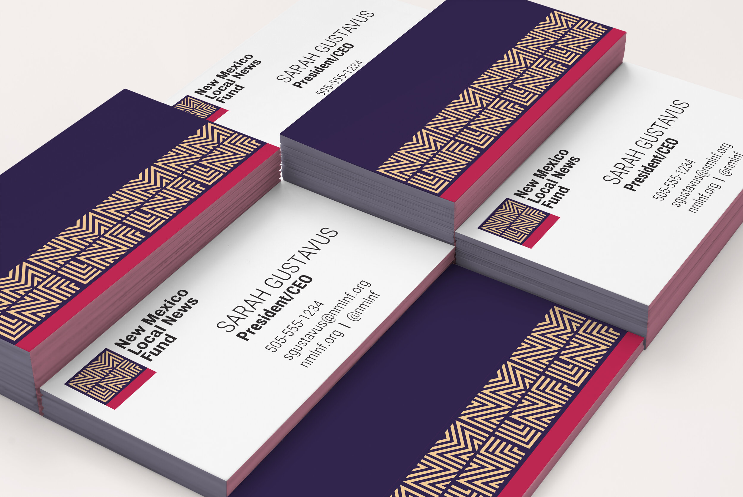
NMLNF didn’t need to establish its credibility as experts in the field of journalism funding — its founder had years of experience in local news. But as a new player, the organization needed to establish itself as a credible, sophisticated voice in the field; and, most specifically, as a voice that understood the unique complexities of the local communities it serves. In particular, we identified the need to really situation this identity in New Mexico but without relying on any typical or expected design cliches (especially those that are common and appropriative) — no turquoise, no zia symbol, etc.

Unexpected but familiar.
A unique logo and identity system that builds on brand traits and infuses local identity while avoiding geographic clichés or appropriative imagery. It borrows and builds on common patterns and colors used in local and Native art, but without appropriating any specific imagery or symbolism. The identity grew from the patterns and movement established by the icon into a flexible system of ownable elements. NMLNF's advisors unanimously approved the new identity. They have already begun using their new branded materials in pitch meetings with potential funders and to connect with grantees


Roles
Creative Direction, Brand Strategy, Design