

DC Commuter Rail Map
People think of the DC Metro — which is admittedly magnificent — as a rapid transit system. It fills that gap, but that’s not how the system was designed. It’s much more effective at getting people into and out of the city; it excels in being a commuter rail system like MARC and VRE. This misunderstanding has prevented the city from deeply investing in intradistrict transit options. I wanted to explore how a geographically accurate system map for Metro could better help residents understand the state of District transit.
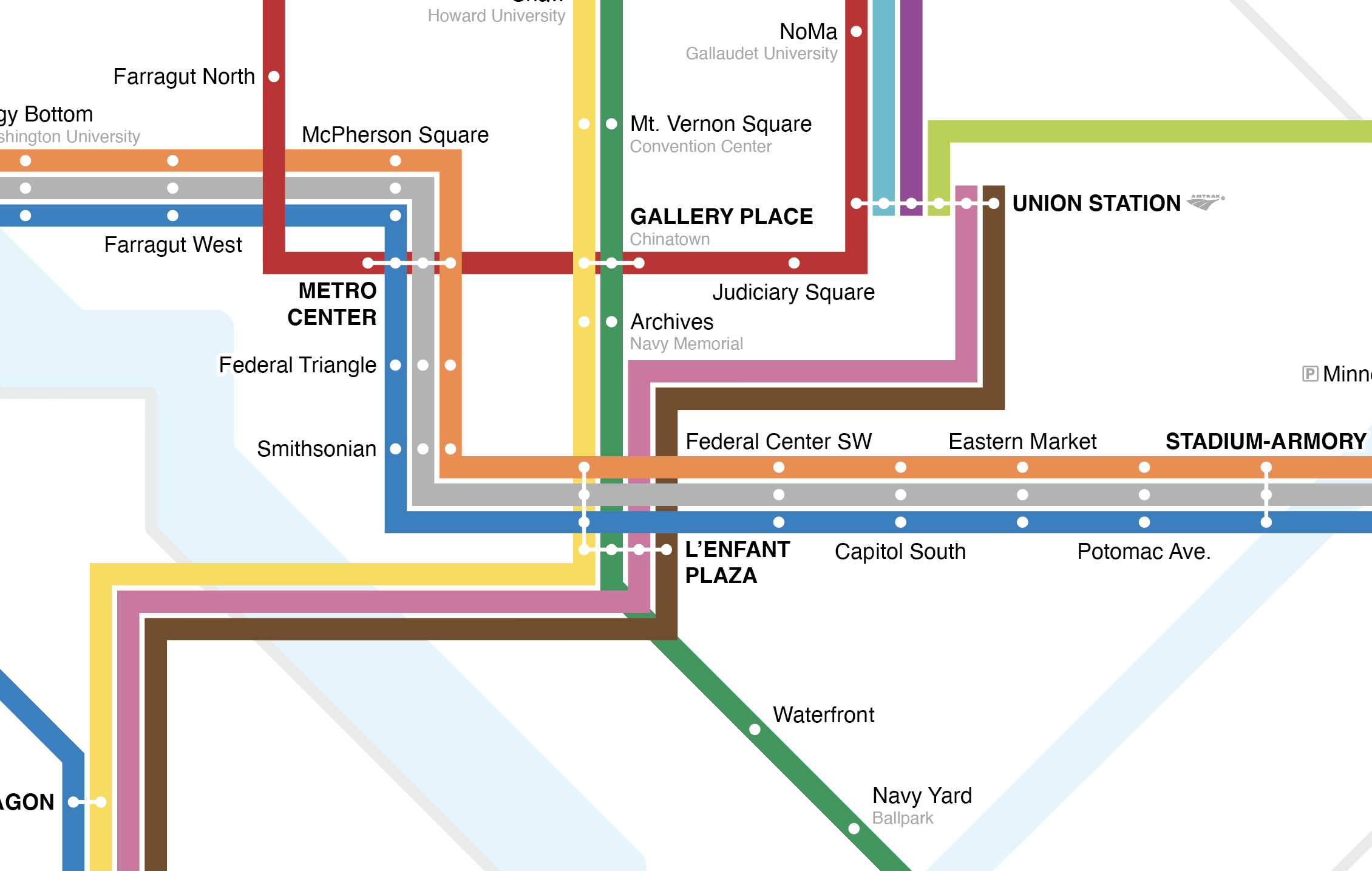
Less iconic, but more accurate.
Lance Wyman’s DC Metro map is iconic — but it distorts the system into a tight shape that suggests greater coverage within the district than is accurate. By design, the spoke-and-hub design of the Metro system is much more effective at getting riders in and out of the city than around it. I believe this leads to struggles with rider satisfaction and decreases support for additional funding for other modes of transit. To explore how a new system map could change perceptions, I incorporated MARC and VRE commuter rail into a unified system with the Metro and favored geographic accuracy to show regional coverage. More accurate geography helps to recontextualize Metro and better illuminates connections around the DMV region. This map has been reviewed favorably online by experts in wayfinding.


